


Madera™
字体介绍
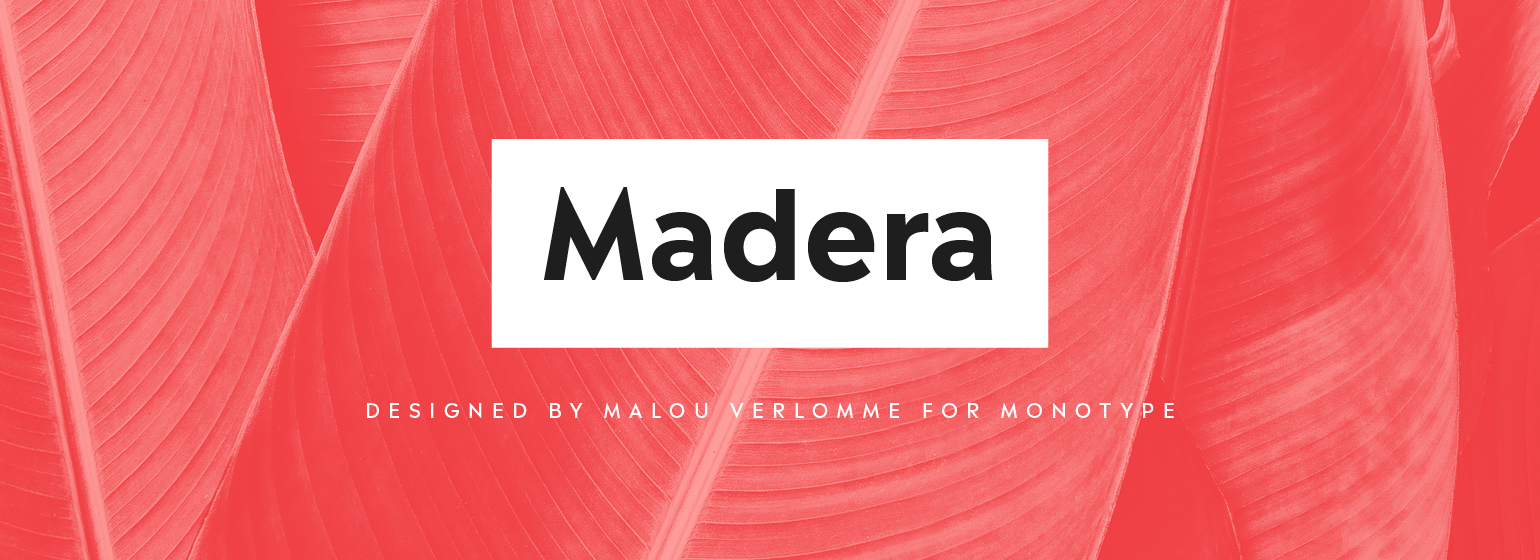
Ma lou Ver lomme 的 Madera 是一款严格为平面设计师制作的字体,不可或缺,可以满足印刷和数字环境的需求。Ver lomme 借鉴了他丰富的经验,为各大品牌创造定制字体,而 Madera 则是这项工作的“排版”版本。字体看似时一款内敛的无衬线字体,但仍有一些强有力的个性——尖锐的顶点注入设计的味道,特别是较大字重和大写字母时。如果用户作为一家大公司,在许多不同的环境中使用字体,那么根本所需则只是适当的平衡可见性和易读性,以维持广泛的阅读量。Madera字体家族有 32 种字体。它可以在 Open Type CFF 和TTF字体格式。每个字体包含超过 650 个字形,支持西欧,中欧和东欧语言。它还支持 Open Type 排版功能,如替代、连字和分数。
Overview Malou Verlomme’s Madera is a sharp-tongued take on geometric typefaces, created to be an essential toolbox for graphic designers. History of the typeface Verlomme’s approach was heavily informed by his own experience creating bespoke type for brands, as well as a background creating typefaces in partnership with graphic designers. It’s the user he has in mind for this typeface, which is intended as an easy, efficient, and adaptable design – tailored to the ways graphic designers actually use fonts. It also designed to tap into a trend for geometric sans serifs, in the style of other popular designs such as Proxima Nova, Avenir or Gotham. About the designer Malou Verlomme is an award-winning French typeface designer working as a Senior Type Designer at Monotype UK, since 2016. He has a Graphic Design degree from l'École Duperré in Paris, and an MA in Typeface Design from the University of Reading. He taught type design at several universities in Paris and still occasionally lectures and gives workshops. His typeface Camille has the honor of being part of the collection at France’s Centre National des Arts Plastiques (CNAP). His typefaces include Ecam and Totem published with the foundry LongType, which he co-founded in 2012. In 2016 he designed the Johnston100 typeface for TfL, London’s new underground typeface. Design traits The Madera typeface family has 16 fonts: 8 weights of both upright and italics. It is available in OpenType CFF and TTF fonts formats. Each typeface contains over 650 glyphs with extensive Western, Central and Eastern European language support. It also supports OpenType typographic features like alternatives, ligatures and fractions. It lives somewhere between humanist and geometric styles, and features sharp apexes that add some extra flavour – particularly when set in all caps, or when used at darker weights. Usage Madera has been created as the ultimate easy-to-use typeface for graphic designers, designed to work across environments and be highly legible whether used in print, or on screen. Its appearance is restrained, making it perfect for branding messages, but still includes punchy details that add some undeniable bite.
字体展示
基础信息
- 字体品牌:Monotype
- 设计师:Verlomme,Malou
- 字体分类:无衬线体
- 字体属性:外文
- 字符集:Unicode
- 发布时间: 2018